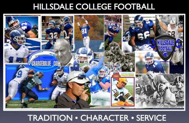
Logo change aims for 'consistency' and 'strength'
By: Liz Klimas
Posted: 4/17/08
Today the Hillsdale College athletic department changes identity but not tradition. The department announced replacing the H and lightning bolt logo and a new identity and accent color. Welcome the stallion alongside a plain, serif block H, and refreshed Charger blue and white with a new gray accent.
"Before now, the athletic logo has never been clearly defined," said Angela Lashaway, college art director. "We tried to find a happy marriage of the history of what's been used and what a Charger is."
Athletic morale runs high this year with the programs' success making it ready for change, Athletic Director Mike Kovalchik said. Last fall the department began development of a new, modern image evoking strength and consistency.
"We wanted to maintain our colors and logo to some extent," Kovalchik said. "This change can be looked at as a strength change."
Kovalchik said President Larry Arnn and the administration first began coming up with ideas to change the athletic logos. By the 2009 to 2010 athletic season, uniforms will be replaced and the football field and basketball court centerpieces changed, Kovalchik said while financial logistics are still being worked out.
"This year coming up is a transition year," Kovalchik said. "It still may be two to three years of process because the volume of things being changed."
The current royal blue will be changed to what Kovalchik called a "strong" blue and, in addition to white, gray will serve as an accent color. Kovalchik said the new blue will be easier to match, a change that "needed to be made from a business standpoint."
"Now we have a logo and colors that are across the board," Sports Information Director Brad Monastiere said, emphasizing the importance of consistency in the athletic program. "Right now different teams are using different things."
Baseball, softball and volleyball already use gray in their uniforms, and men's basketball and baseball have even used black. Kovalchik said he wanted to make gray an official color and eliminate use of black all together.
"It's a challenge, but it's a fun challenge," Kovalchik said. "Now [teams] have to focus on consistency."
Red as an accent color was also discussed during the process but ultimately turned down.
The profile of the stallion accented with the new blue, gray and white replaces the H-lightening bolt. The design team integrated the lightning bolt motif into the stallion's mane. While Kovalchik felt the H lightning bolt was a successful logo, he said the strength emanating from the stallion transcends the H lightning bolt.
"Logos have to mean something to a college or university," Kovalchik said. "When you lose that logo, that tradition, that pride, you lose a lot. We all look to something that motivates us ... Something strong, we can identify with. We need to focus on this logo's strength, on its identity."
Monastiere said he will incorporate the new logo and colors into all schedules and publications to spread the news and excitement about new logos.
"We want to portray that this is our identity today and this is our identity going forward," he said. "This is who we are and this is who we are going to be. This is an opportunity for students to grow with the logo."
Lashaway, who coordinated the process between the department and the designer, said the two symbols officially work to make one logo, though they occasionally have single uses.
The department will officially announce changes on Great Lakes Intercollegiate Athletic Conference Football Media day on Aug. 5. Though Kovalchik said he looks fondly back on the H lightning bolt, he, Lashaway and Monastiere are positive about the change.
"We'll never forget the H with the lightning bolt," Kovalchik said. "We hope that everyone will take part and welcome it in a good way. We are going to keep this a positive thing, and we are going to go with it full-go 100 percent."
© Copyright 2008 The Collegian
Welcome to Chargerblue.com, your Internet home for Hillsdale College Football. Keep up to date on the Chargers, the GLIAC, and NCAA Division II football with Andy Losik's Charger football news and comment blog.
Tradition • Character • Service
Subscribe to:
Post Comments (Atom)
Search The Chargerblue.com News and Comment
Blog Archive
-
▼
2008
(146)
-
▼
April
(7)
- Hillsdale's Mark Nicolet signs with Detroit Lions
- Hillsdale Quarterback Eager to Return from Injury
- Collegian: Logo Change Aims for 'Consistency' and ...
- Hillsdale Nail it! New Logo Rocks!
- Spring Game Wraps up Spring Session on Sunday
- Veldeer, Yassay, Stempien Lead the way at Lift-A-Thon
- RJ Walters Gets it. He Really Gets it!
-
▼
April
(7)
3 comments:
The old H-Bolt was strength and consistancy! When did we become the Hillsdale College "Sea Horses"? The H-Bolt was solid and strong, much more then a carton that resembles a "Sea Horse"! And tradition and consistancy... how is CHANGING or logo fit either of those words. We have always had a Lighting Bolts on or helmets and that would be ashame if that changed.
the "h-bolt" stinks
u r right a Sea Horse is MUCH better. Wow!
Post a Comment